The Challenge
Crafting UbiqTern’s brand identity involved addressing several key challenges

01
Complex Services:
The company’s offerings, including advanced AI automation and sustainability-focused supply chain solutions, needed to be presented in a way that was both accessible and memorable.
02
Market Differentiation
Operating in a competitive landscape alongside industry giants, UbiqTern needed a distinct, relatable identity that established trust and credibility.
03
Global Appeal:
The brand had to resonate with a diverse audience, from logistics managers to executives, across regions and industries.
The Solution
We took an in-depth approach to create a visual and narrative identity that authentically represented UbiqTern’s mission, vision, and values while addressing its challenges.
1. Defining the brand personality
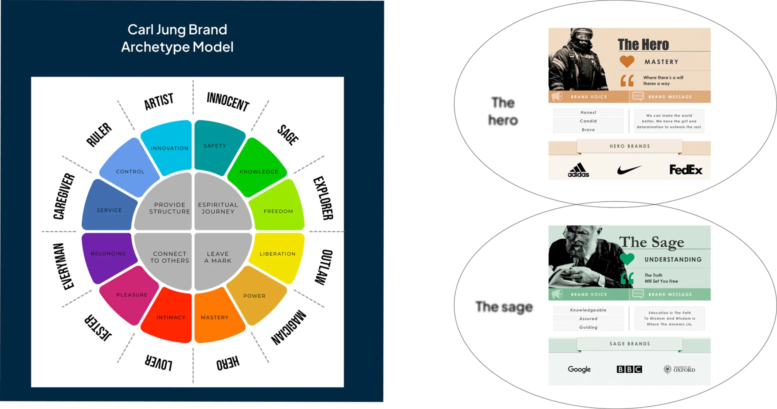
Using Carl Jung’s archetype framework, we identified UbiqTern as a combination of the Sage and the Hero:
The Sage:
Represents wisdom, guidance, and stability, aligning with UbiqTern’s expertise in optimizing supply chains and driving sustainable practices.
The Hero:
Represents courage, leadership, and transformative action, showcasing the brand’s ability to deliver bold, impactful solutions.
By balancing these archetypes, we ensured that UbiqTern’s identity conveyed expertise, thoughtfulness, and dynamism.
2. Crafting the visual identity
Our visual strategy was designed to reflect the brand’s dual personality while making it relatable and impactful:
Logo:
Inspired by the Tern, a bird known for its precision and resilience, the logo symbolizes UbiqTern’s guiding role in navigating complex supply chain challenges. Its “U” shape emphasizes inclusivity and a client-first approach.

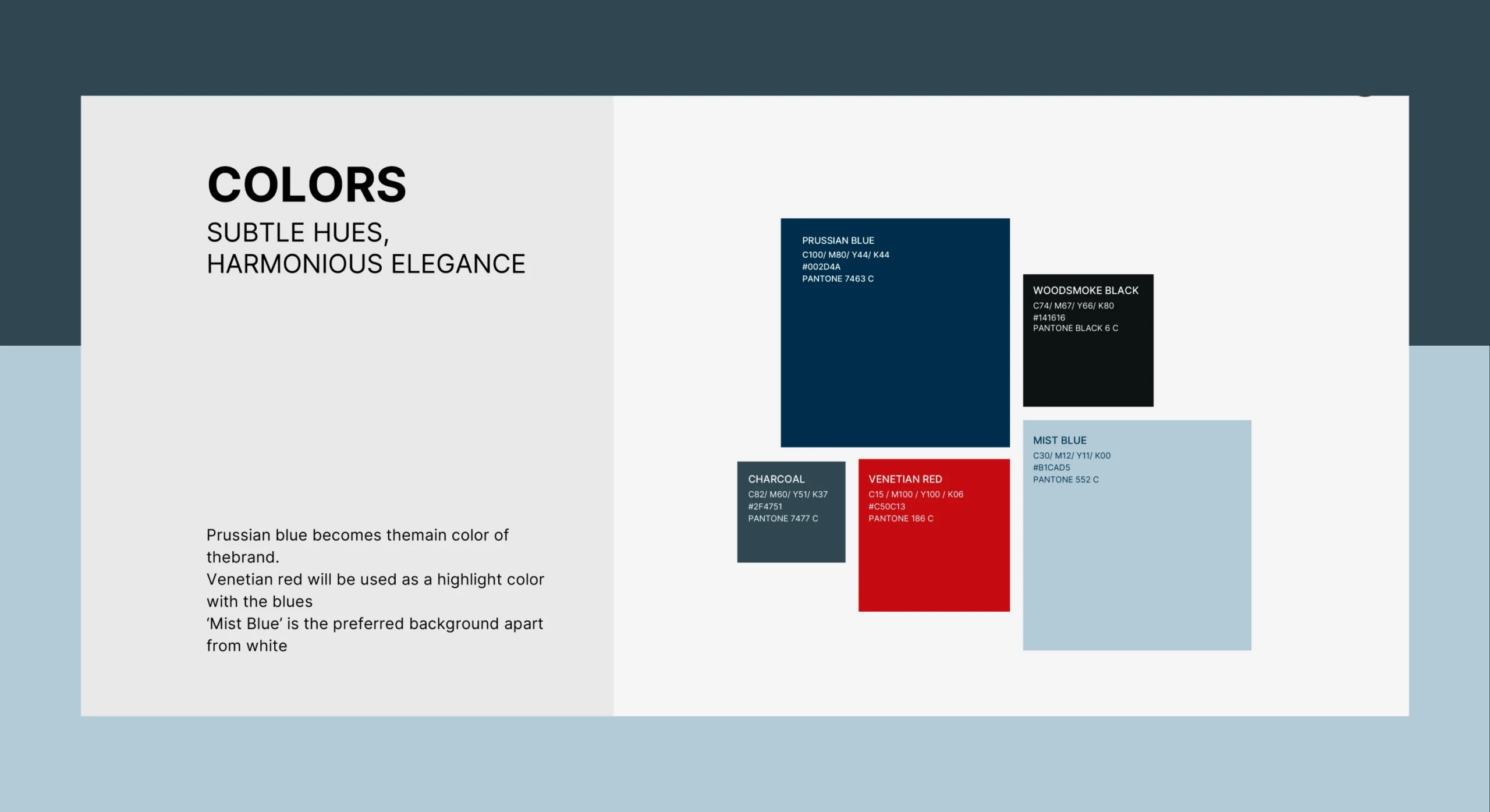
Color Palette:
- Deep Prussian Blue as the main brand color: Represents wisdom, stability, and trust (Sage).
- Bold red accents: Reflects courage, transformation, and leadership (Hero).
Typography:
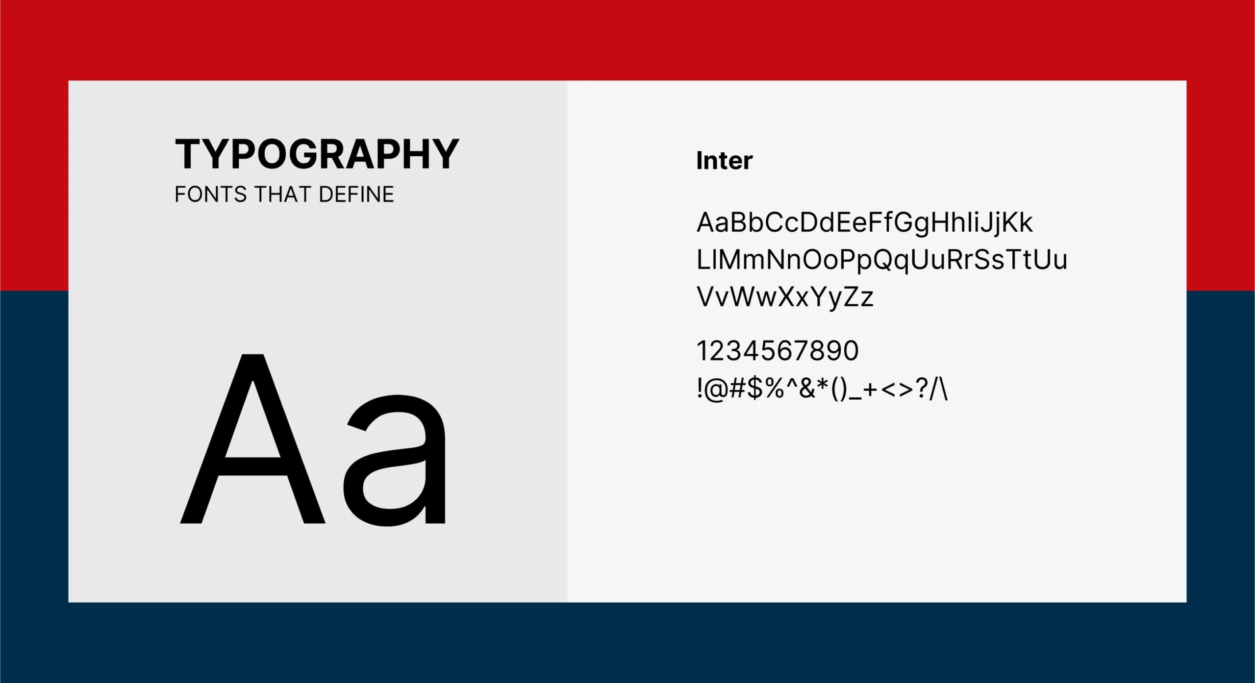
- Primary Font: Inter(sans-serif), modern and approachable, reflects UbiqTern’s innovative and client-focused approach.
- Supporting Fonts: Serif fonts were used sparingly to convey tradition and depth, in line with the Sage archetype.
Imagery:
- Human-Centric: Depicts collaboration, diversity, and satisfaction, with well-lit, emotion-focused visuals of teams working together.
- Non-Human: Highlighting large-scale logistical operations, interconnected systems, and natural sustainability elements like greenery amidst industrial settings.

3. Building the narrative
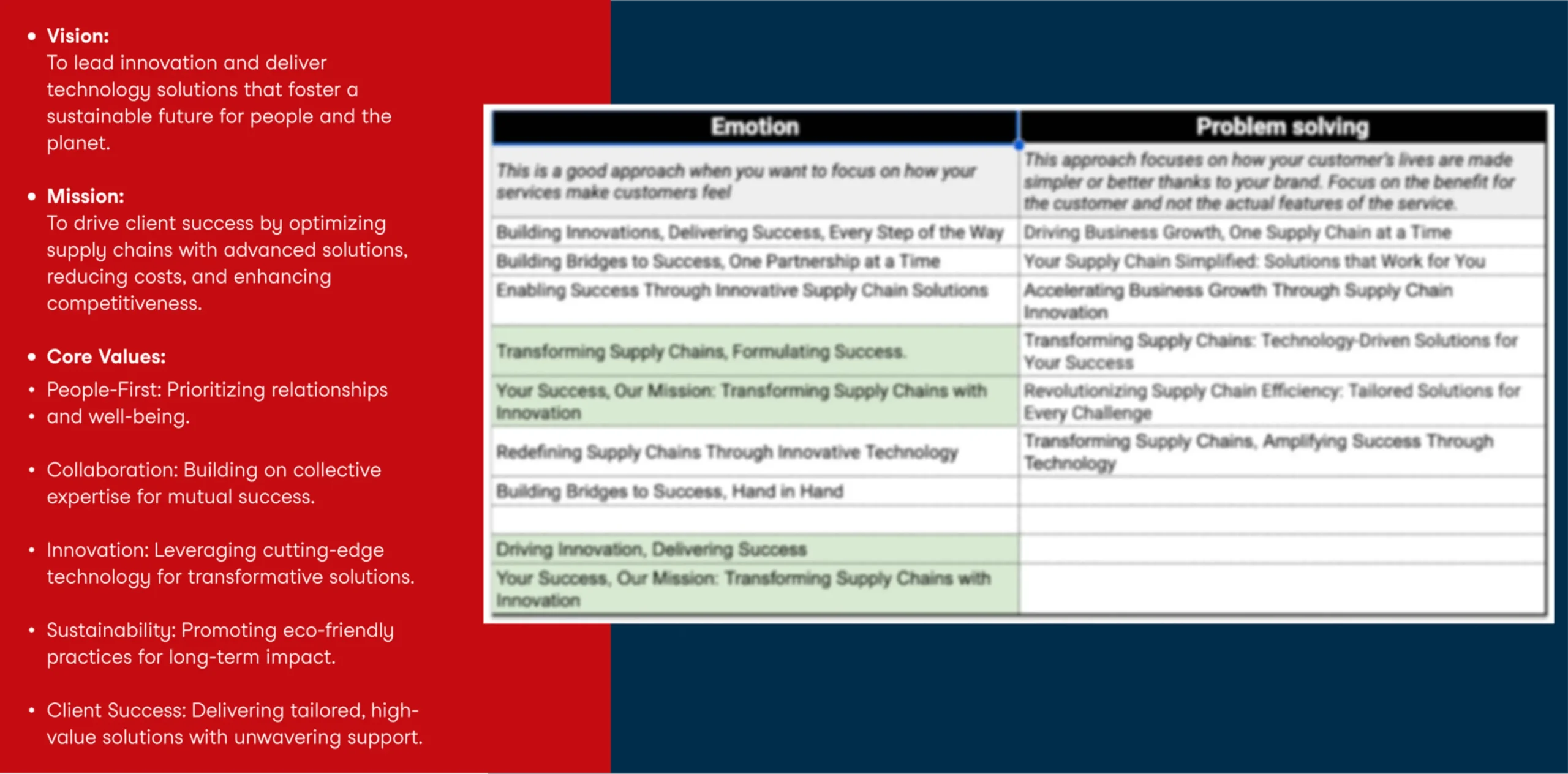
We developed UbiqTern’s foundational brand statements to establish its purpose, values, and aspirations clearly and cohesively:
Why:
These statements were created to position UbiqTern as a thought leader and a trusted partner, combining wisdom with action to solve complex challenges.
How:
By translating the company’s vision and personality into actionable statements that guide UbiqTern’s operations and communications.
Key Brand Statements:
4. Bringing the identity to life through comprehensive brand assets
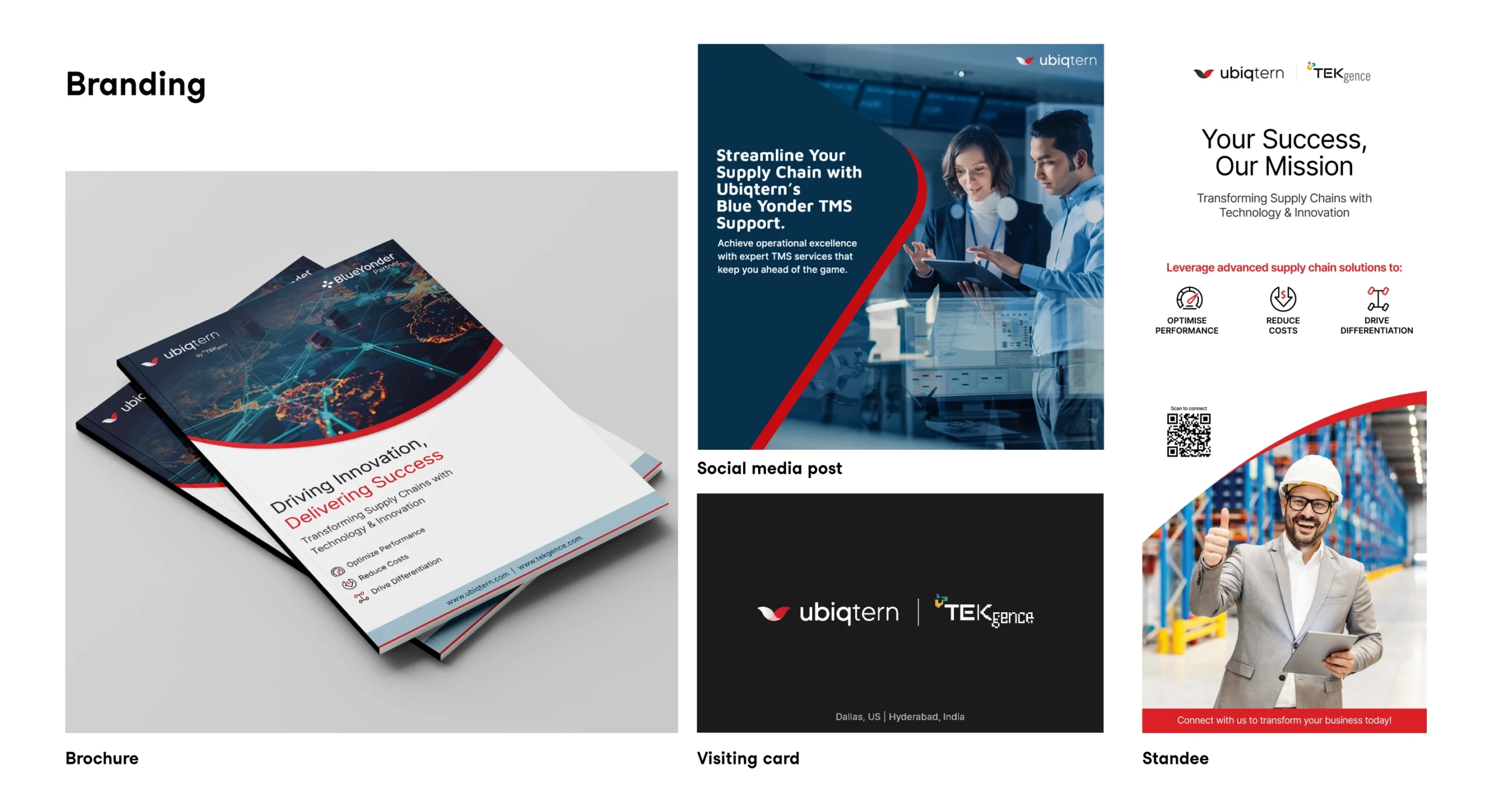
Assets that brought the brand to life-
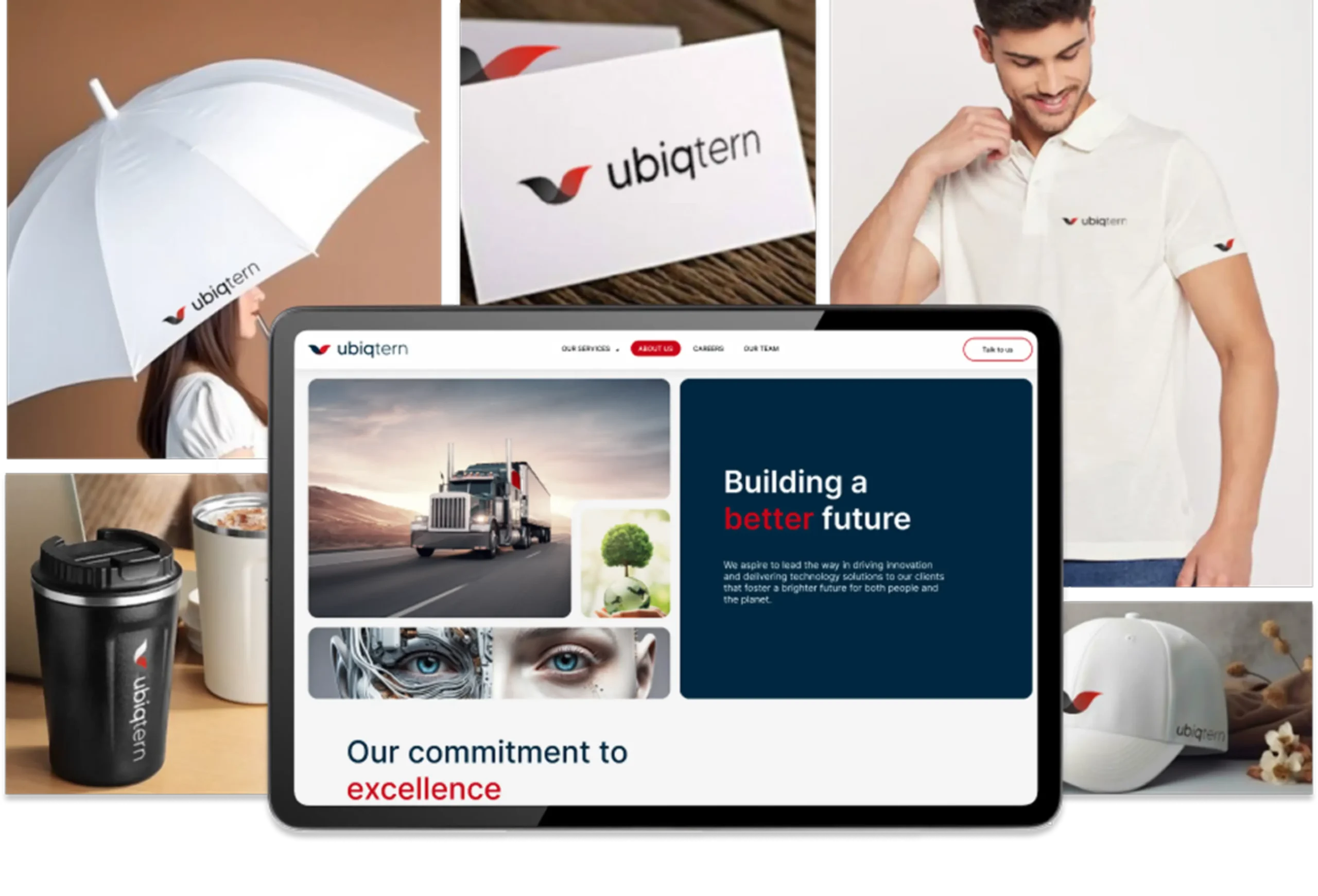
Brand Assets: Letterheads, business cards, and company deck.
Marketing Collaterals: Company launch posts, brochures, one-pagers, standees, and infographics showcasing UbiqTern’s expertise, offerings, and strengths.
Brand Guidelines: A comprehensive guide to consistently apply visual and narrative elements across all channels.
Impact
The brand identity positioned UbiqTern as a bold, reliable partner in supply chain and commerce:
Stronger Market Presence:
A distinctive visual identity that differentiates the brand in a competitive space.
Clearer Communication:
Simplified messaging that makes complex services accessible and relatable.
Stakeholder Engagement:
Resonant storytelling and visuals that inspire trust and confidence across diverse audiences.


